Turn complex banking tasks into clearer flows.
Everyday tasks needed to feel direct, safe, and understandable. The work focused on hierarchy, feedback, state clarity, and reducing unnecessary cognitive load.
Redesigning the Argentina online and app banking experience across web and mobile, connecting everyday money movement, product discovery, insurance, loyalty, accessibility, and the operational reality of a large financial institution.
Santander did not have a single set of pain points. It was a huge ecosystem of workflows, screens, components, user needs, constraints, and legacy systems that had to be coherent for internal and external users.
The challenge was to reduce friction on the web side, and kick-off a stronger mobile design system foundation, while helping the bank present new products and benefits in a way that felt transparent, actionable, and easier to scale across channels and partners.
Banking for humans.
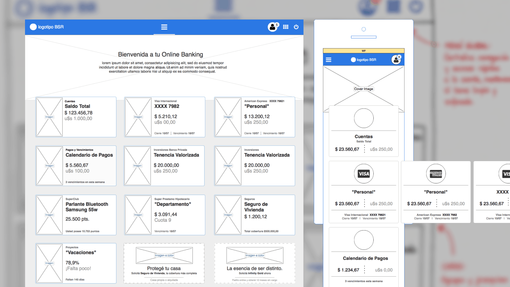
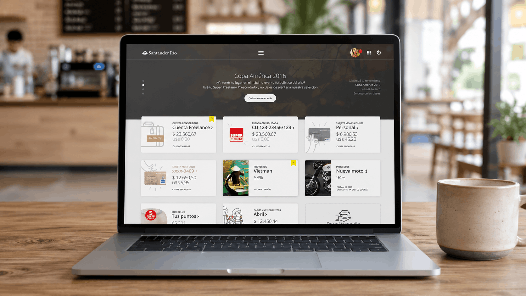
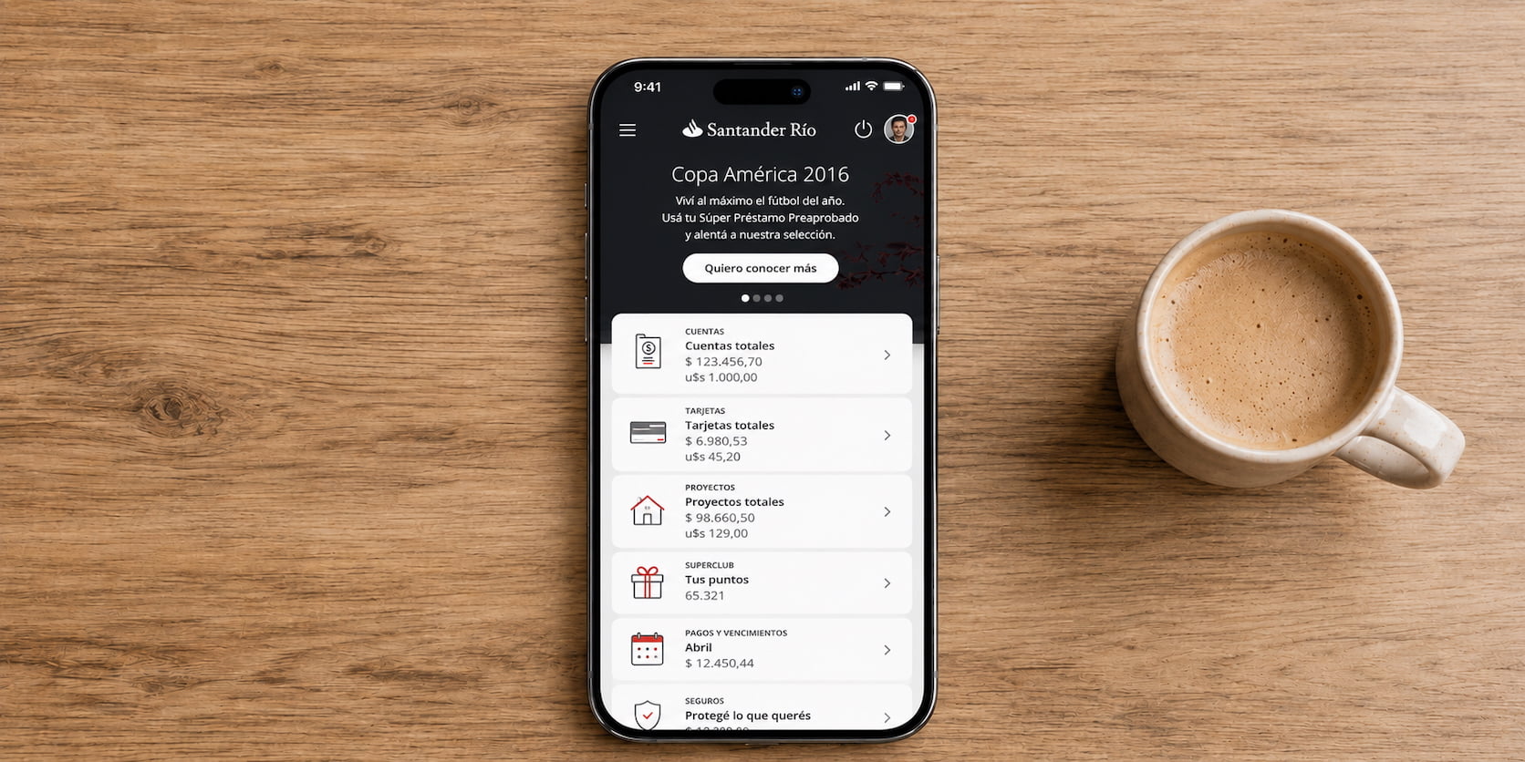
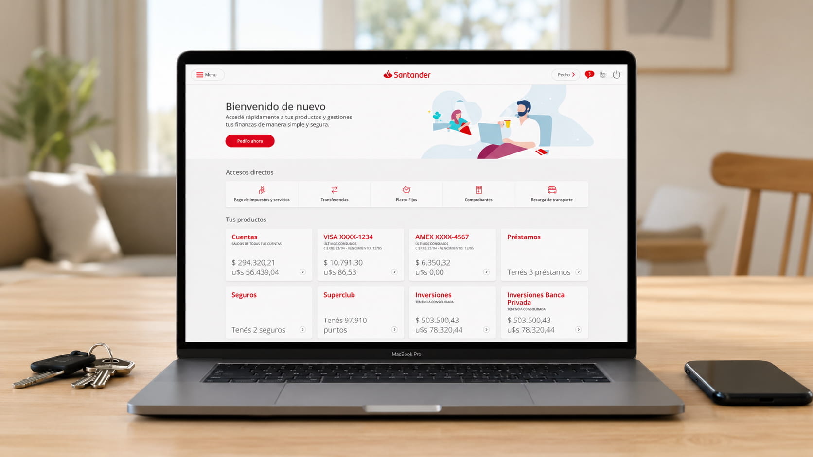
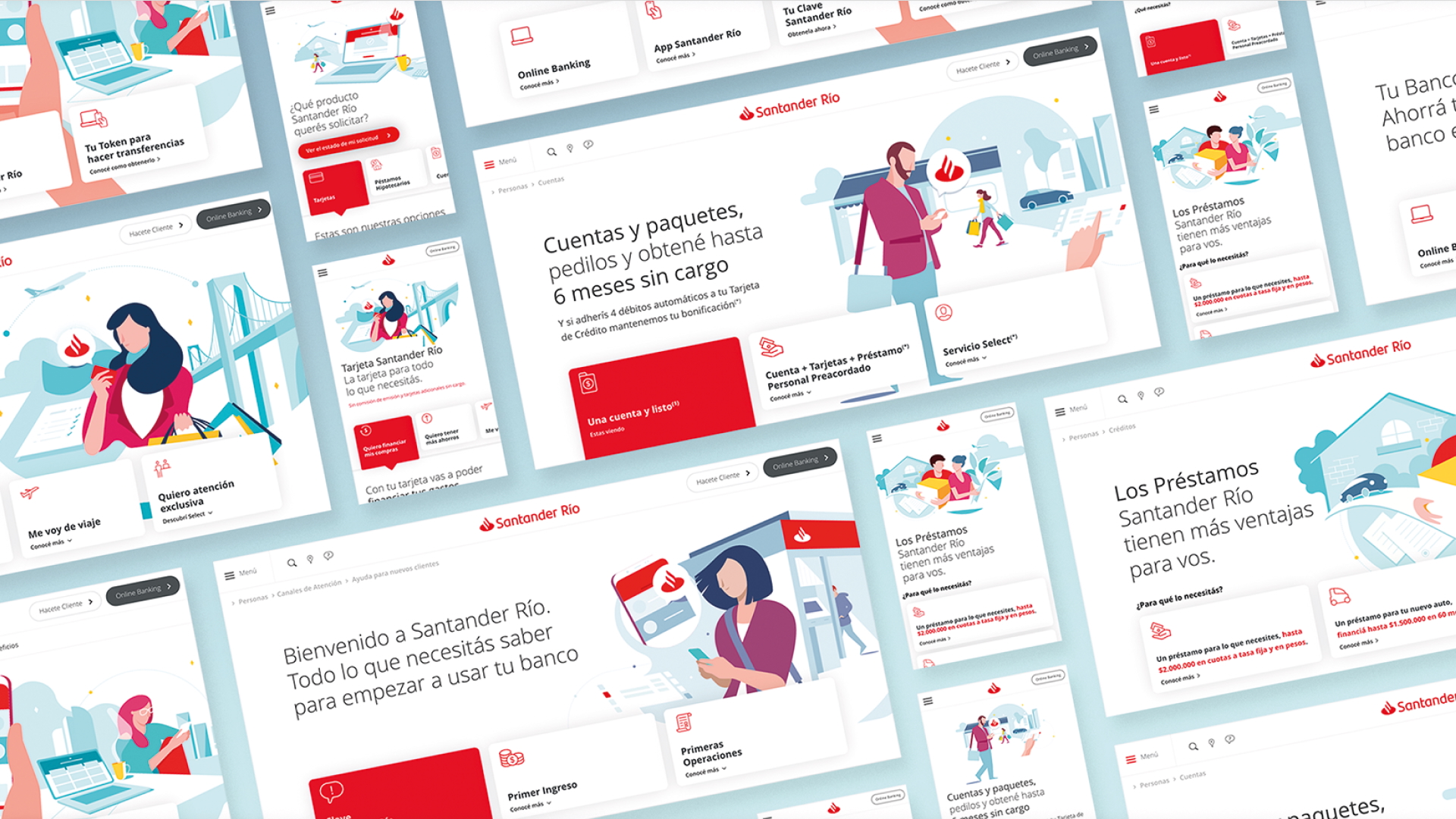
A way of working across research, prioritization, mobile-first design, product strategy, interface craft, and delivery in a regulated environment.
The work started by mapping how people moved through banking moments: checking balances, paying, transferring, using cards, discovering benefits, resolving issues, and moving between web, mobile, branches, and support.
The goal was to identify where complexity was useful, where it was accidental, and where design could create a more coherent service experience.
Mobile was not only a smaller interface. It became a forcing function to decide what mattered most, what should be simplified, and how the same banking logic could scale across devices.
Flows were explored through wireframes, prototypes, and service scenarios that helped teams discuss user behavior, business rules, edge cases, content, validation, and handoff before committing to delivery.
A large banking experience needs consistency without becoming rigid. I contributed to patterns for navigation, forms, product cards, alerts, transaction states, confirmation moments, and reusable structures for services like insurance and loyalty.
Part of the work expanded into product and retention experiences: insurance, loyalty, benefits, and personalized opportunities that needed to feel connected to the banking relationship, not added as disconnected promotions.
The final design work was only valuable when it became usable software. Delivery required detailed specifications, collaboration with engineering, design QA, iteration, and constant translation between customer needs, banking rules, and technical limitations.
Across Santander, I helped shape end-to-end digital banking experiences across web and mobile, connecting discovery, interaction design, design systems, business alignment, and execution.
The work moved between strategic framing and detailed product craft: understanding customer needs, simplifying journeys, defining reusable patterns, and supporting delivery for experiences used by millions of people.
Everyday tasks needed to feel direct, safe, and understandable. The work focused on hierarchy, feedback, state clarity, and reducing unnecessary cognitive load.
Mobile-first thinking helped the team simplify interaction models and create a stronger foundation for customer behavior moving away from desktop-only habits.
Banking experiences had to work across app, web, branches, support, and business processes. The design challenge was to make those transitions feel less fragmented.
Insurance journeys required balancing commercial goals with clarity, timing, confidence, and relevance inside a trusted financial relationship.
Loyalty was an opportunity to increase engagement by making benefits easier to understand, access, and connect to the customer’s everyday use of the bank.
Reusable interface decisions helped the experience scale: navigation, alerts, confirmations, forms, product modules, transaction states, and responsive layouts.